The Best White Paint Colors According to Our Designers
White walls offer a clean, modern look that creates a calm and orderly environment; setting the stage to showcase furniture, art, and lighting. With so many options and known by so many names (ecru, off-white, bright white, cream?) choosing a white paint is not as simple as it looks. Each shade of white has subtle undertones and appears differently depending on the amount of natural light in your home. Additionally, the white you choose should complement what is in the space (think fabrics, furniture, and art). With endless white paints to choose from, we decided it was time to ask the experts.
Betsy Isackson, Senior Interior Designer, The Decorators Unlimited:
OC65 Chantilly Lace by Benjamin Moore
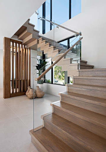
“Benjamin Moore Chantilly Lace provides the perfect backdrop for my interiors.” Chantilly Lace offers “a true white- with no yellow, pink, or blue undertones- which is great for homes with a ton of natural light,” like this waterfront beauty in Ocean Ridge, Florida.
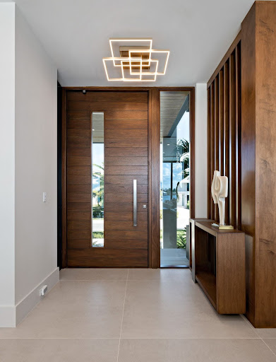
Betsy’s designs offer an inviting mix of elements by incorporating natural stone and organic wood with soothing white walls to create a thoroughly modern vibe.
Cheryl Sweeney, Senior Interior Designer, The Decorators Unlimited:
OC23 Classic Grey by Benjamin Moore
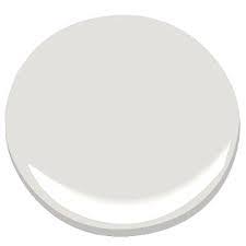
Benjamin Moore OC23 (Classic Grey)
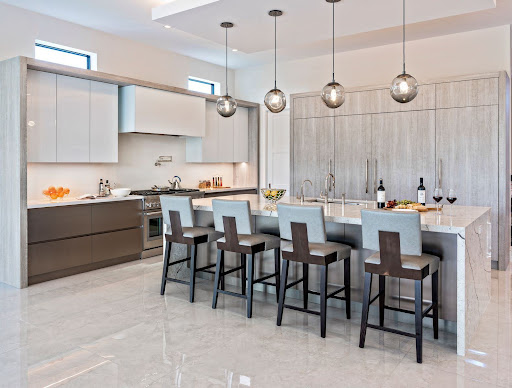
Cheryl Sweeney designs a modern, yet timeless, kitchen with white walls and adds her signature look: inspired lighting!
Tanner Villani, Senior Interior Designer, The Decorators Unlimited:
Swiss Coffee, Bright White, & Chantilly Lace
“I have three that are my go-to. Swiss Coffee from Benjamin Moore for a warm white. Chantilly Lace from Benjamin Moore for a bright white. White Dove from Benjamin Moore for a neutral tone white.”
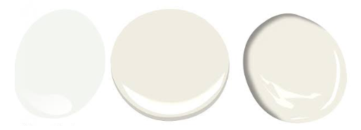
Noting that every project calls for a slightly different white, these are Tanner’s top three choices. (l to r: Chantilly Lace, Swiss Coffee, White Dove; all from Benjamin Moore)
Lisa Lalaounis, Senior Interior Designer, The Decorators Unlimited:
High Reflective White by Sherwin Williams
“My go-to white paint is High Reflective White by Sherwin Williams. It is a timeless choice because it creates a sense of spaciousness, brightness, and cleanliness. It reflects light making a room appear larger and more airy while also serving as a backdrop that complements any décor style.”
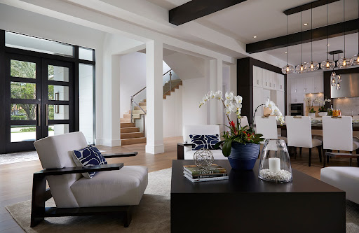
Lisa showcases contrasting furniture with white walls for a classic take on a modern design.
Decisions, Decisions…
Choosing a perfect shade of paint can be surprisingly challenging. We get the inside scoop from Interior Designer Tanner Villani as he fills us in on his process.
Q. How do you choose a paint color?
“Paint colors are always the last thing I choose in a design. I work with a color in mind (an airy white, a moody blue), and I always save finding the right shade for when I have my fabrics, rugs, and wood finishes selected. It helps me narrow down my selection. I then get peel-and-stick samples of the color and test them in the client’s home on multiple walls at different times of the day to confirm that we do not need to alter the color at all.”
Q. How about finishes?
“I work primarily with a matte finish on the walls. It hides imperfections and when applied correctly it has almost a tactile velvet finish to it. I love the look! I always suggest a level five paint finish whenever the budget allows.”
Q. How can a designer help me get the look I want?
“Designers make the process look easy because we go into it with a method or a plan of attack. We aren’t looking at 1,000 colors at a time we are looking at 20 and narrowing the selection down by undertone and LRV (light reflection value). It takes time and a bit of experimenting to make the process look seamless. But that can be said about a lot of what we do in our work. Practice makes perfect!”

